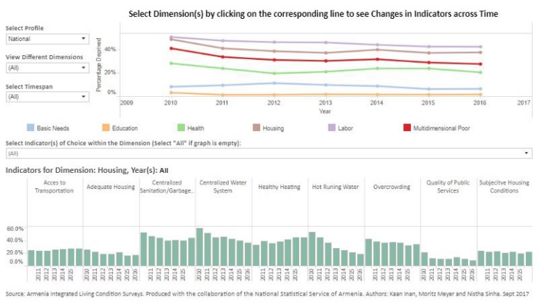
On the dashboard, the line graph at the top shows the progress both in terms of overall multidimensional poverty and five dimensions, while the bar graph in the lower section specifies the underlying indicators for each selected dimension. Users can choose different sub-populations through the “Select Profile” option and analyze how each selected group performs overall, as well as among the five dimensions and all the indicators.
A close look at the dashboard reveals that the share of the population deprived in more than one quarter of all indicators dropped notably from 41% to 28% over 6 years. Remarkably, this decrease was consistent among all subpopulations analyzed in the dashboard including various geographic areas and consumption quintiles. Geographically, the most substantial decline was in rural areas (53% to 30% over 6 years) while the second and third consumption quintiles experienced the largest decrease in terms of welfare groups at 18 percentage points.
The decrease in multidimensional poverty was mirrored across all dimensions, albeit at diverse levels. Labor, housing and health dimensions experienced larger declines, while deprivation in basic needs and education dropped only one percentage point over 6 years. However, the latter two were the least deprived dimensions in Armenia to begin with, making further reduction increasingly challenging.
At the indicator level, the bar graph in the bottom of the dashboard illustrates how different components of a dimension – housing, in this case – can impact overall performance differently. The percentage of people without hot running water drops sharply over the 6 years, while deprivation in access to transportation worsens. The opposing trends show that there can be areas for further progress at the indicator level, even if there is overall improvement at the dimension level.
Multidimensional welfare analysis is a necessary compliment to monetary based measures – both from a conceptual perspective and for pragmatic purposes. In addition, explicitly tracking progress across identified indicators and dimensions offers concrete evidence to policy makers and researchers. The Armenian example, through the dashboard visualization, demonstrates the additional benefits of the multidimensional approach for measuring welfare comprehensively.

