Author: Minh Cong Nguyen and Johannes G. Hoogeveen
While most economists would agree that the change in per capita income is a solid summary indicator for economic progress, we prefer shared prosperity. Unlike the average change in income, which reflects the change for the average citizen, shared prosperity measures the extent to which economic growth is inclusive by focusing on household income or consumption growth among the population at the bottom of the income distribution. Shared prosperity focuses on the poorest 40% of the population in each economy (the bottom 40). It is because of its focus on the bottom 40 that promoting shared prosperity was selected as one of the twin goals of the World Bank Group (together with eradicating extreme poverty). The shared prosperity indicator matters because it shines a constant light on the growth in living standards of the relatively less well-off segments of the population in any economy. It is an important indicator of inclusion and well-being of an economy.
In this brief we consider four key facts on shared prosperity for the MENA region:
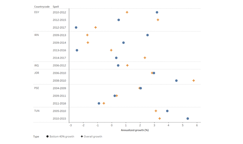
1. Since the Arab Spring, growth has become less inclusive
Looking at the latest available Shared Prosperity data, growth in MENA used to be fairly inclusive, but has become much less so. Of the 15 growth episodes that could be identified (doing so requires comparable household surveys, of which there are few in the region) in about half (7 instances) was growth for the bottom 40% higher than average and the dots lie to the right of the pluses. Yet if one only considers the 6 most recent growth episodes, those in since the 2011 Arab Spring, one finds only one (Tunisia) in which growth has been inclusive.
Fig 1. Shared prosperity in MENA overtime
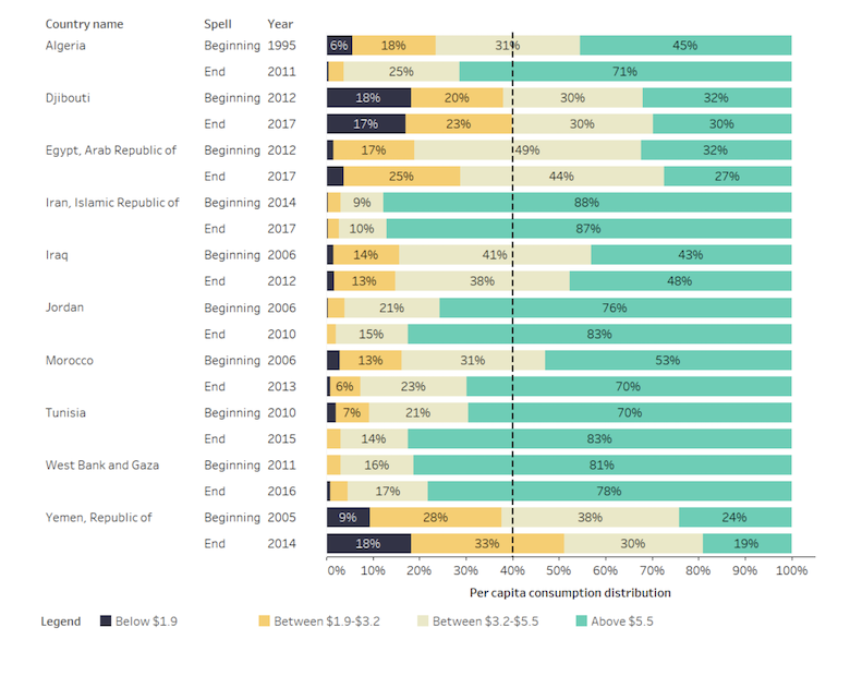
2. Many in the bottom 40 in Iran are better off than the top quintile in Yemen
Across countries, the levels of income of those in the bottom 40% vary substantially. Figure 2 plots the distribution across income-based groups within countries. Identified are the extreme poor, as defined by the World Bank’s international poverty line (less than $1.90 a day); the middle-income poor, who live on between $1.90 and $3.2 a day; the upper-income poor, who live on between $3.2 and $5 a day; and the non-poor group, who live on more than $5.5 a day, all measured at 2011 constant purchasing power parity (PPP).
In most countries, the bottom 40% fall amongst the extreme and middle poor. In Djibouti and Yemen, the bottom 40% does not include anyone above the middle-income poverty line. Comparing incomes across countries one finds that those in the top 70% or 80% in Djibouti and Yemen are worse off than those households in bottom 40% in Iran.
Comparing incomes over time within countries one finds that the bottom 40% generally become wealthier and that the proportion of the poor with incomes between $3.2 and $ 5.50 or more increases.
Fig 2. Bottom 40% can represent various income groups across countries overtime
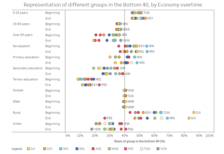
3. Bottom 40% are young, uneducated and live in rural areas
Figure 3 looks at the characteristics of the bottom 40 across time and countries. When the dot for a country is found to the right of the 40% line, this characteristic is overrepresented amongst the bottom 40. If it is to the left, the characteristic is underrepresented. Generally speaking, the bottom 40 are young “0-14 years old”, have no education, and can be found in rural areas. There are marked differences across countries. In Djibouti, for instance, the more than 80% of the bottom 40 can be found in rural areas, compared to less than 50% in Palestine.
Over time one notes that the bottom 40 become a bit more educated. One also finds generally fewer b40 people in rural areas.
Fig 3. Representation of different groups in the Bottom 40, by country overtime
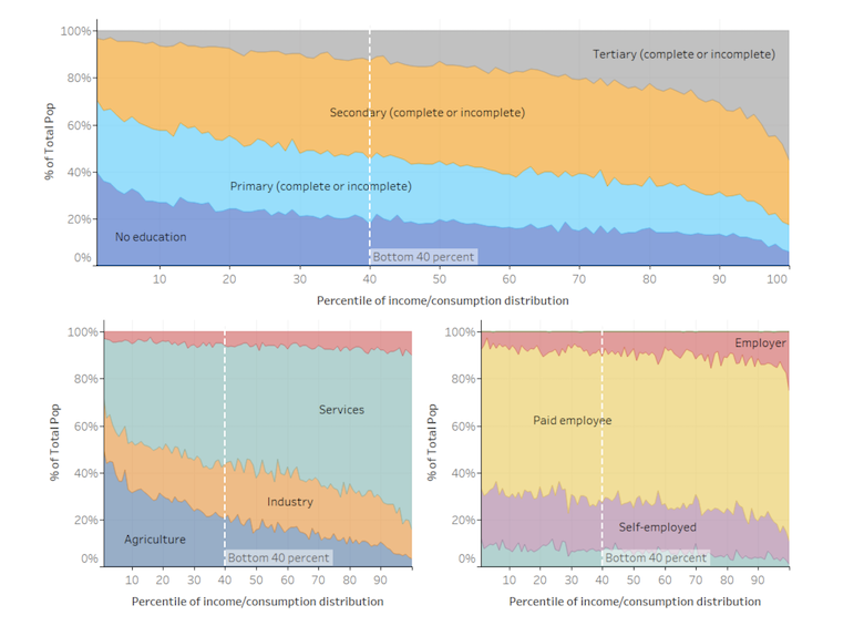
4. Top 60% are with higher education, working more in services and industry sector and are employer and paid worker
Figure 4 pools all available data for MENA. It shows educational attainment, sector of employment and type of employment across the income distribution for the region as a whole. Those at the bottom of the income distribution have low levels of education, no stable income (non-paid employee and family worker, or self-employed) and in the agriculture sector, thus making them more vulnerable group and harder to progress in the ladder of the distribution.
Figure 4: MENA at a glance across the income distribution