
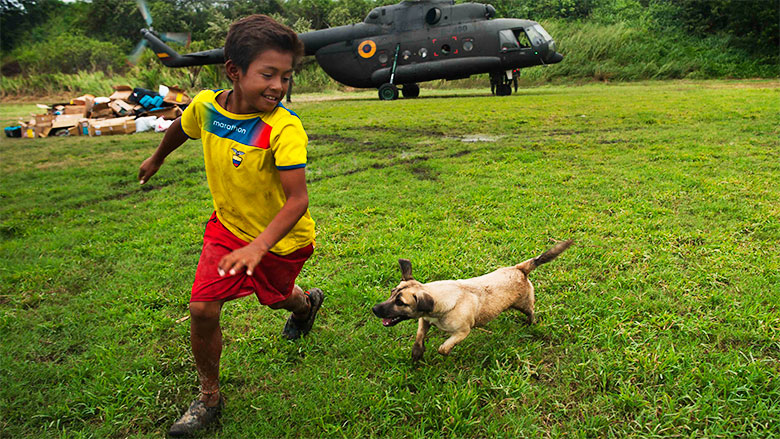
Following an earthquake like the one that struck Ecuador last April 16 (which left more than 500 people dead and some 30,000 people affected), the first priority is aid. With more than 1,000 buildings destroyed, including 280 schools, assessments of damages continue to be carried out to determine the time and resources necessary to enable the affected zones to return to normal.
How is the decision made on where to begin work?
Several tools exist that help identify the most vulnerable zones. One of them is the recently launched poverty map of Ecuador, a World Bank report with statistics on how poverty is distributed throughout the country. Ana María Oviedo, senior economist at the World Bank’s Poverty Global Practice, explains what this tool is and how it is used:
Question: What is a poverty map?
Response: It is an estimate of the percentage of poor in the total population. It is geographically disaggregated information at a very detailed level. In the case of Ecuador, the smallest geographic-political space is the parish, which may be urban or rural. The next level up is the canton, followed by the province. A poverty map enables officials to estimate the number of people who live below the moderate and extreme poverty lines at the level of parishes, cantons and provinces. Poverty maps are normally used for social programs. In the initial phases of these programs, the maps help demarcate the geographical areas that will be covered to reach the poorest citizens.
For example, Manta Canton in Manabi Province, one of the areas hardest hit by the recent earthquake, had a population of over 225,000 and a poverty rate of 18% in 2014. However, the poverty map divided by parishes demonstrates that the parishes of San Lorenzo and Santa Marianita are the poorest. Despite having just over 2,600 inhabitants each, those parishes have poverty rates of 44% and 39%, respectively, considerably higher than the 18% average rate for the canton.
Q: How is a poverty map developed?
R: Data from the last population census and that of the household consumption survey, known as the Living Conditions Survey, are combined to provide a detailed estimate of the incidence of poverty. Poverty projections are made to define a map for the zones studied
Q: How often is a poverty map made?
R: Data cannot be outdated. In Peru, for example, household consumption surveys are conducted annually, but censuses are not. However, there are other databases that complement this information. Thus, for the country’s last poverty map, the 2007 population census was not used; rather, researchers utilized data from the Household Targeting System (SISFOH) of 2013. In Ecuador, household consumption surveys are less frequent and it is somewhat more difficult to develop the poverty map. The map is always created with the most recent census data available. In the case of Ecuador, the 2010 population census was used.
Q: How can this tool serve aid organizations such as the Red Cross?
R: In the case of a natural disaster, while it is clear which area is affected, some organizations will attempt to prioritize interventions in zones where human or material are greatest. Normally, poor areas are more susceptible to these disasters. Additionally, they have inferior living conditions and less access to services, making them much more vulnerable to all types of catastrophes. These locations head the list for rescue and aid operations.
The poverty map enables any institution or organization to target its interventions. In this case, the Red Cross needs to act, but not necessarily in all of the affected areas. Following certain criteria, the poverty map enables the organization to target and prioritize the areas where it will work.
For example, Perdenales Canton was one of the areas that suffered the most damage from the earthquake. Ninety percent of its commerce was affected, according to the Risk Management Secretariat of Ecuador. The canton, with a population of 54,000, has an average poverty rate of 54%. Cojimíes, the second-largest parish in the canton, has an even higher poverty rate of 65%. This figure is key for determining where to prioritize aid.
Q: How are response activities planned using the poverty map?
R: The poverty map only provides information on consumption patterns of individuals living below the poverty lines. To get a clearer idea of the population’s needs, this map is complemented by the unmet basic needs map, which provides more details on the conditions in which people live: overcrowding, access to water and sanitation and electricity, whether adequate or inadequate housing materials are used, etc. Both maps provide information to enable sanitation work to begin in the area with the greatest need for this service, for example.
Planning depends on the organization that will use the poverty map and/or that of unmet basic needs. The Red Cross will most likely implement health interventions. Both maps provide specific information in this area. This allows the organization to prioritize geographic areas for interventions.
